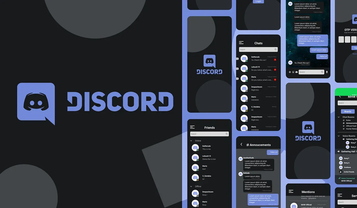
Overview
Discord is a free to use instant messaging and digital distribution platform. Where users can communicate with voice call, video call, and messaging, media and files in private chats or as part of communities called “servers”.
Background
With more people doing meetings online with the current world situations. Due to covid people are forced to do everything remotely. That includes communities and small company searching for a platform where people can communicate. Discord is one of platform that provide the services needed. People can message, call, or sharing screen online without hassle and it’s all free to use. With Discord Nitro which provide a quality of life service such as HD streaming and Large file sharing features.
To put things into perspective Discord number of users jumps in 2019 to 2020 from 56 million to 100 millions users. Almost double in number. With 300 million total user registered in 2020 alone. That number is very impressive.
But there is one thing I find Discord is missing. While Discord focuses on the desktop version of it, the mobile version is almost just a copy of it. For experienced user it will be easy to use since it’s basically just the same app. But for new user coming to discord things will be very confusing. After helping countless friend who just use discord for the first time, I found it is hard for them to navigate in the mobile version of the app. Even some of the experienced user said that it’s a bad design and hard to navigate.
With this project I will try to analyze the Discord mobile experience. And create a mobile first approach for Dicord mobile app.
Analyze
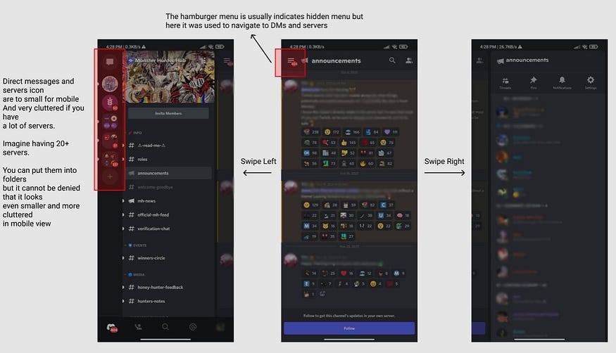
Discord mobile uses 3 layout approach just like the desktop version. Where Left is to navigate between Servers and direct messages. while the right part shows whose online or offline.

Objective
- Identifying the main problem of discord mobile for both experienced and new user.
- Creating and optimized mobile first experience for Discord.
- Making it easier for new users that experience discord through mobile first. or is not using the desktop version.
Design process
1 — Empathize
To understand what the user are thinking and experiencing with mobile Discord, I will choose Interview method. The goal of this interview is to find out what new and experienced user are experiencing while using mobile Discord. And the problems they are facing while using mobile Discord.
Interview questions :
- Do you know Discord?
- What platform are you using for Discord?
- What do you use Discord for?
- How long have you use Discord?
- Do you use Discord on mobile phone? (Skip if number 2 answer is mobile)
- What do you think about Discord mobile? Is it easy to use?
- What do you like about Discord mobile?
- What don’t you like about Discord mobile?
- In your opinion what needs to be improved from discord mobile?
For the interview itself I’ve chosen 5 new user (<2 months of use) and 5 experienced user.
After doing interviews with both new and experienced user I’ve gathered some data that prove it is hard for new user to navigate the current flow of discord mobile app. Even a daily discord mobile user said that the flow of the application was awful for mobile use.
It is a proof that both the flow and design of discord mobile need some overhaul so it’s friendlier to new user.
2 — Define
Now expanding on the problems that have been gathered here are some pain points found :
- Hard to see because of the cluttered view.
- The 3 layout makes it confusing to navigate on mobile.
- The servers Icons are to small.
How Might we?
How Might we design a flow and UI that is mobile friendly?
3 — Ideate
After doing research the first thing that comes to mind for a solution is making discord similar with current mobile messaging apps.
Solution Idea
- Giving the design more breathing rooms to make it less cluttered.
- Creating a new flow or layout system that is mobile friendly.
- Dividing features in different tab or pages to make it clear.
To make things simpler I break discord feature into 3 main features:
- Direct messages.
- Servers and communities.
- Recent Mentions for notifications.
4 — Prototype
Now we can start the prototyping stage, after looking at some ideas and references. I can start by doing wireframing, the idea behind all the design is to make it easier just like a messaging app on the market.
— Wireframe
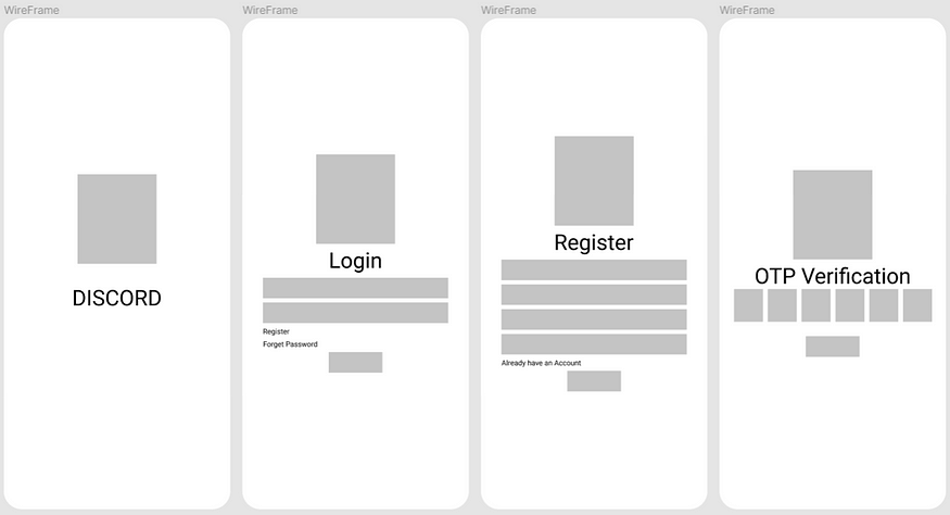

Login — Register
A Simple login and register design with OTP verification.

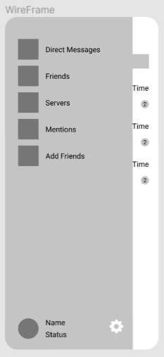
Side Menu
To make things easier I use side menu as a navigation between features.

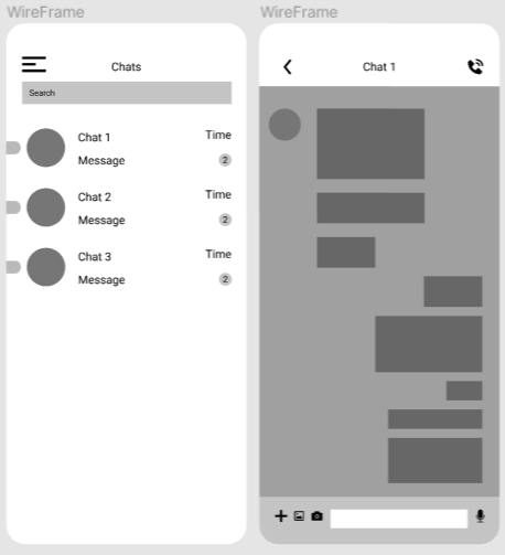
Direct Messages — Chat Room

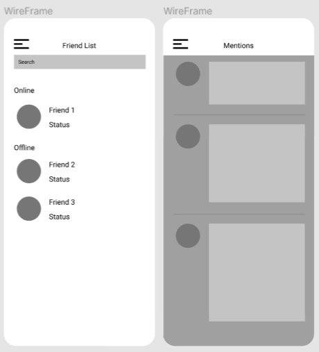
Friend List — Mentions
The friend list will be divided into 2 categories. The one that is online and offline. While the mentions will retain it’s original design.

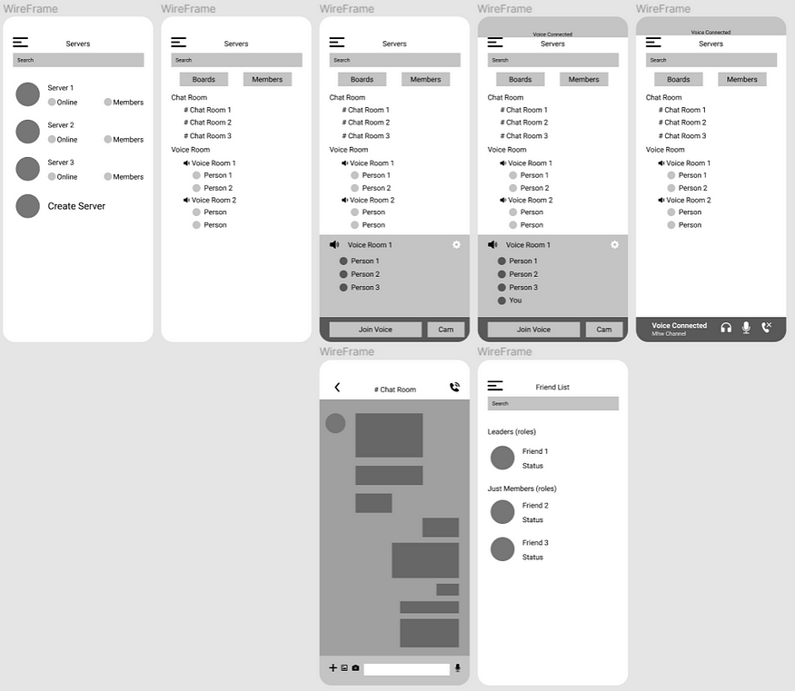
Servers
Here the server will be listed just like chatroom list on chat room page to make it less cluttered and cleaner. The server page itself will be divided into 2 part, the boards which contain both chat and voice rooms for members. And also members page to see the server members and with their role and either they are online or not.
— UI Design
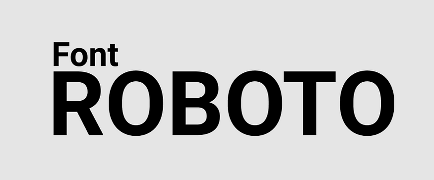
Font Roboto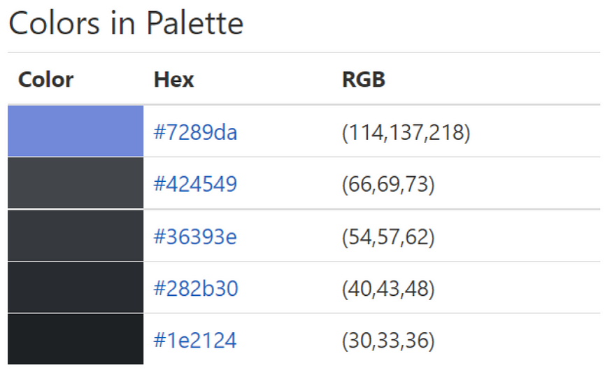
Discord Color palette

Pages

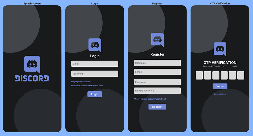
Login Register — Design
Adding a simple vector art to make it a bit more eye catching.

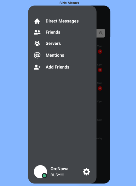
Side Menu — Design

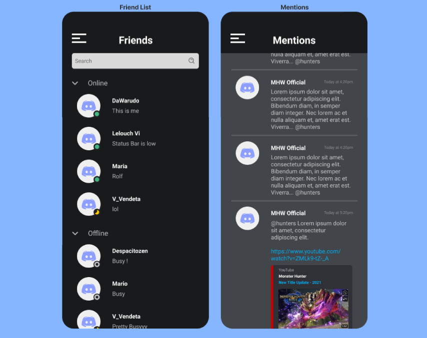
Friendlist Mentions — Design

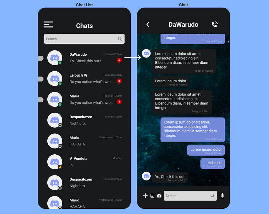
Chat Room — Design

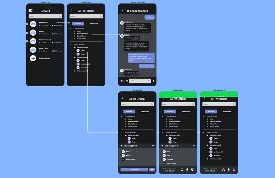
Server — Design
You can see the overall design here :

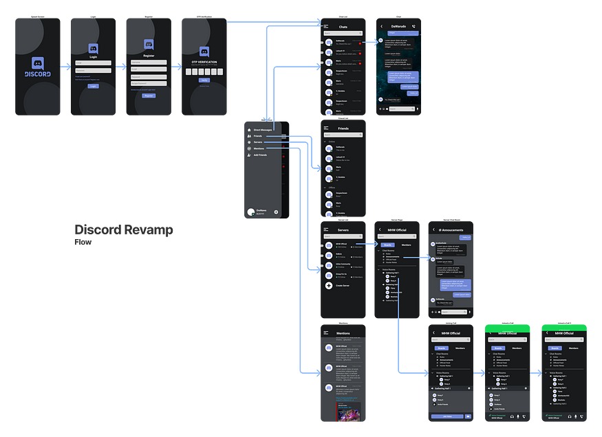
Discord Revamp Overall — Flow
This is what the flow of the design will look like. The first thing that you will see after login in is the direct messages page.
5 — Test
Now for the test, I invited the people interviewed before and do some test. The goal of this test is to see if the redesign is working and if the flow is easier for them to use. The user will be given more or less 3 minutes to explore the prototype, and answer the questions after.
Questions :
- How do you feel about the redesign?
- What stands out in the redesign?
- What do you like about the redesign?
- What don’t you like about the redesign?
- Is there anything you would like to add or improve from the redesign?
— Result
After the interview it was clear that the redesign was easier to use. With 80% (8 out of 10 users) choosing the redesigned more than the previous one. 70% of them agrees that the flow is easier to use, and the 30% of them liked the 3 layout more (It can be noted that all of them are experienced user that use Discord on desktop most of the time).
It can be noted that the redesign can be improved more, like for example one person suggested to add the add friend feature in the friend list page.
With all of that I conclude the project as finished for the time being. And saying that the project is a success.
— Note To self
I learned a lot doing research and designing the project. Especially doing interview and empathizing with user. I might improve the design in the future as my skill grow for the better.
I will keep on learning and honing my skills more and more. As I really want to be a good UI/UX Designer and to be one day release my own product.
“The great aim of education is not knowledge but action.”
— Herbert Spencer
